In depth
The first random social media app.
Client
Fling: See the World
What we did
Brand identity
Product design
Web design
Motion design
Advertising
Illustration
Awards
A'Design - Bronze (Re-brand)
A'Design - Bronze (Sticker set)
Fling is a young start-up with big ideas for disrupting the social media industry. The first random social media app that allows anyone to connect and share their moments.
In 12 months Fling has grown to 5 million users and the founders thought it was time to reinvent Fling’s image.
Let's get started
What the heck is a fling?
Flings are small moments in someone’s life, distributed at random. Think of a modern message in a bottle thrown out to the world for someone to find.
Fling was designed with the idea of providing people an easier way to discover content from around the world.
Before Fling existed people were only able to share photos and videos with closed circles of friends, within well established social media platforms.

Thinking of a master plan
Brand strategy
The strategy was informed deeply by insights, in particular, we found that when people come into contact with Fling they typically have a strong, emotional sense of purpose and individualism, yet this spirit wasn’t communicated through the brand.
Listening to the people who created and used the product helped define a direction for what would become the new brand. The keywords: energy, simplicity, humanity, unique.
Delivering a message
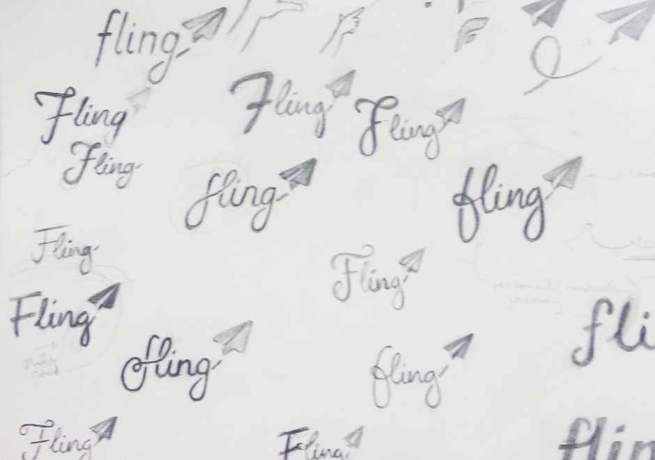
Logo evolution
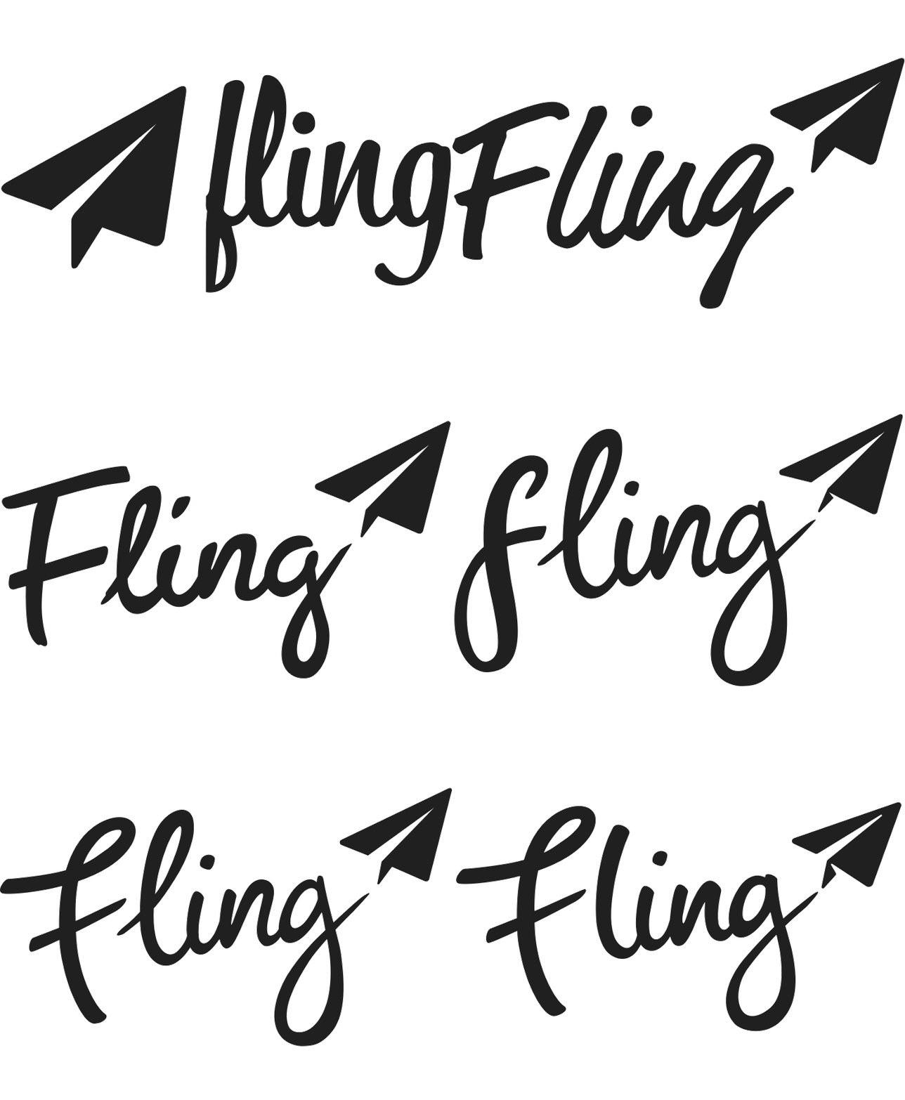
We evolved the signature paper plane with more rigorous geometry and unifies shapes. This is paired with a new custom script wordmark, representing the uniqueness of personality. This was key to reflect the users of the app, each having their own reason and perspective when sending a Fling. Injecting youthfulness, energy, attitude and the journey of a Fling.
Elements of style
The building blocks of a brand
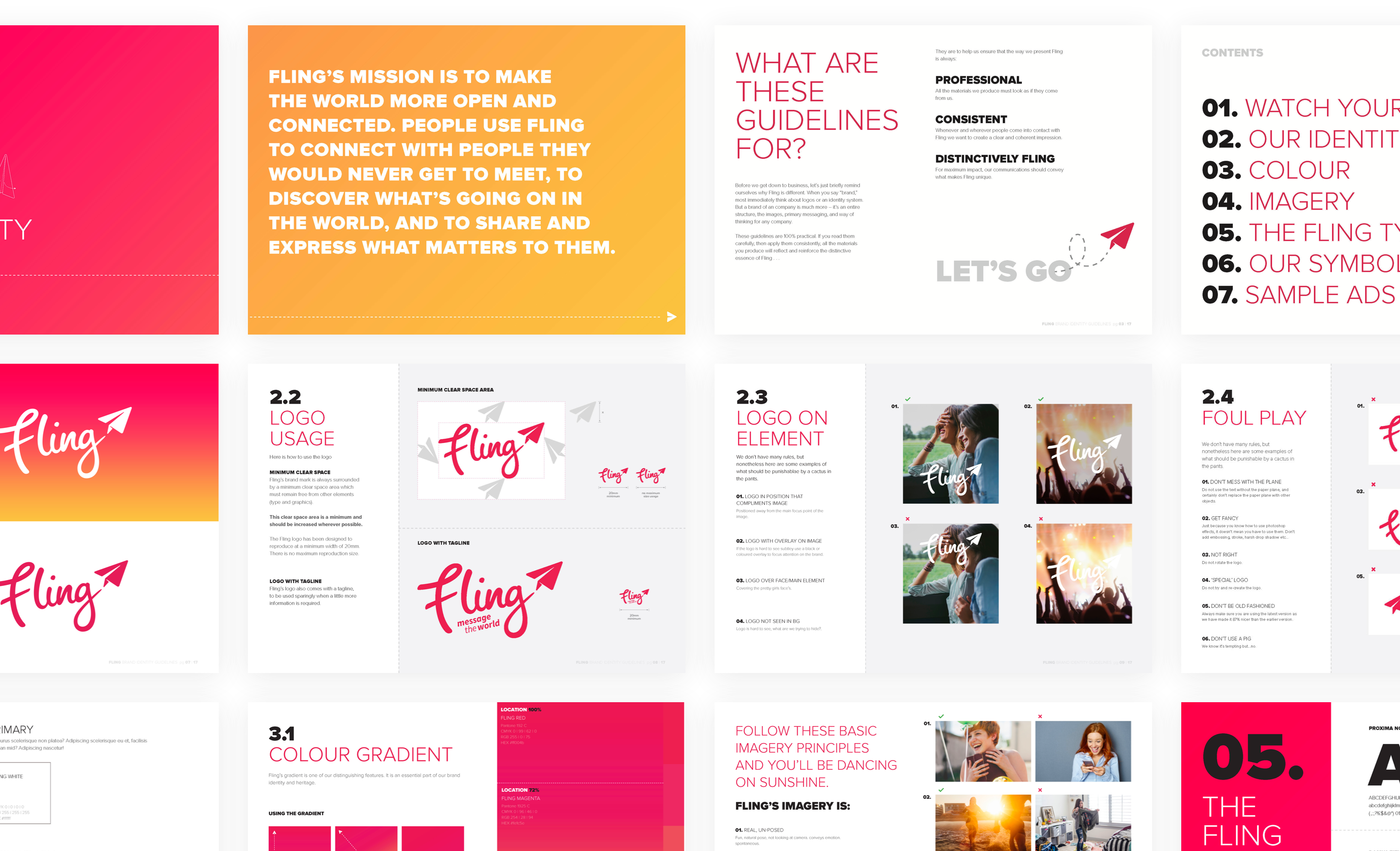
Fling’s gradient is one of its distinguishing features. It's an essential part of the brand identity and heritage. The gradient is based on a sunset, the first Fling ever sent.
What goes into the mix
Fling’s style guide makes sure its fresh, energetic identity — logo, colours, typefaces, illustration, icons, shapes, and all the other little things — will continue to shine through consistently in every situation, from business card to billboard ad.
On the move
The Fling app
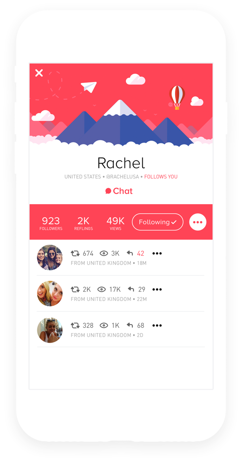
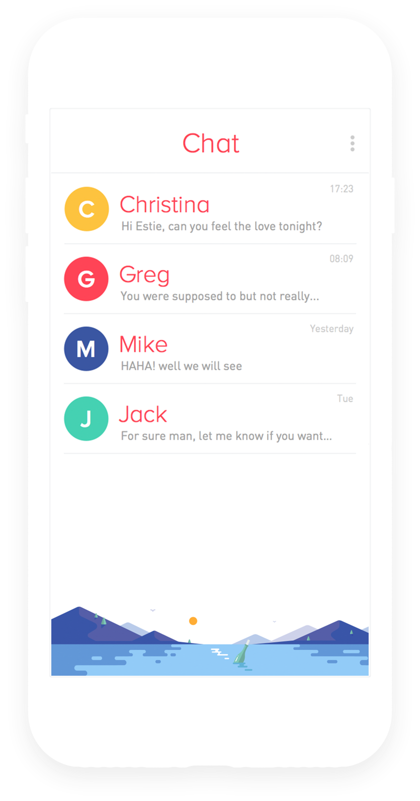
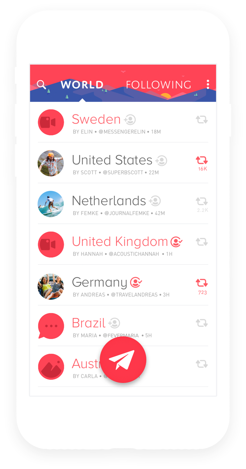
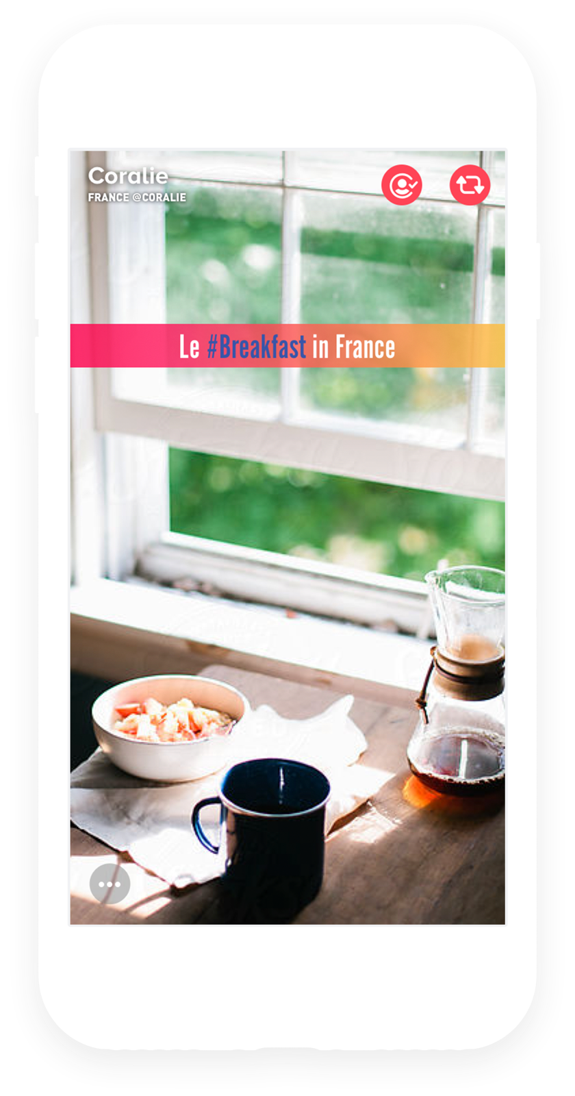
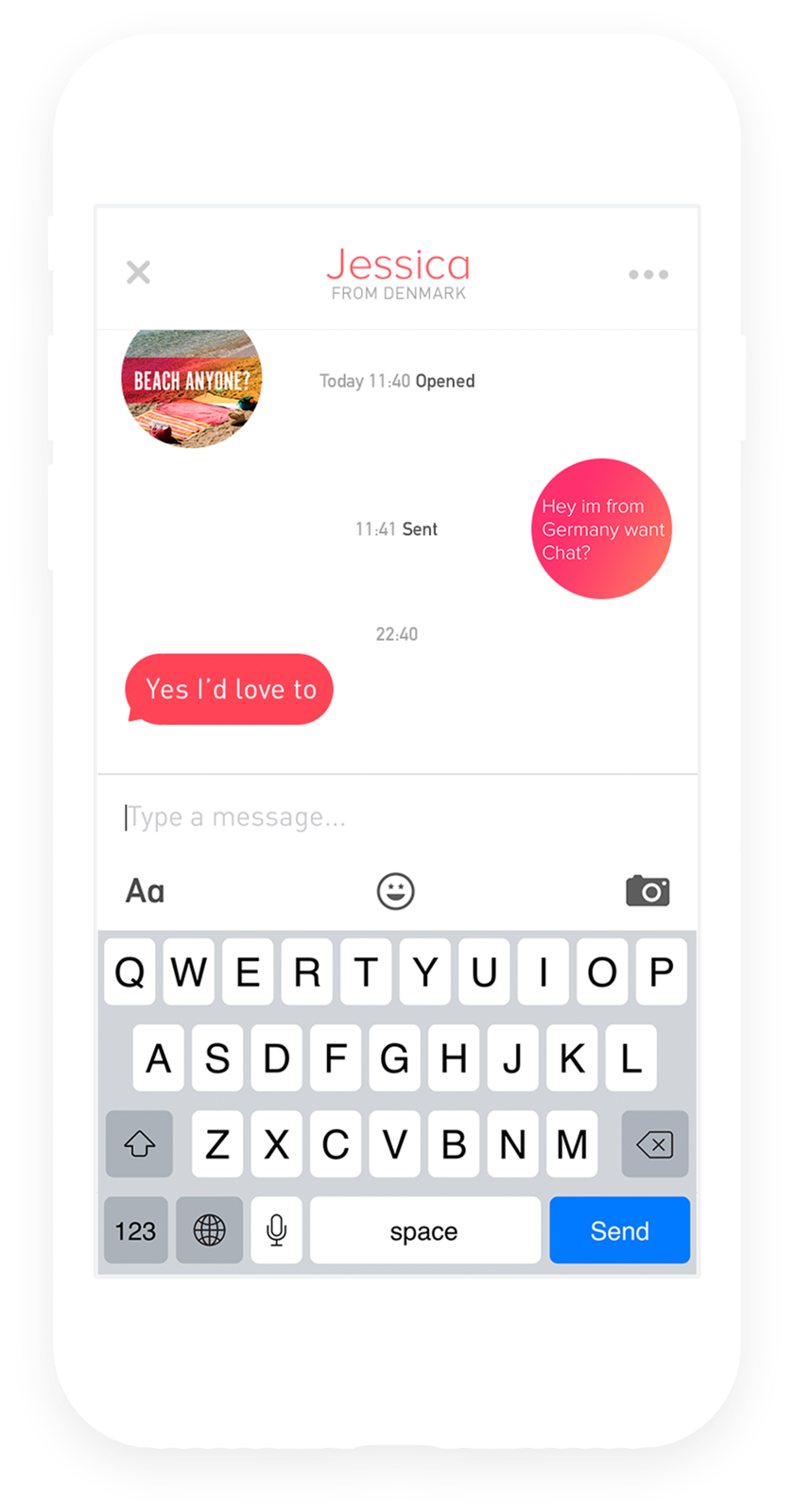
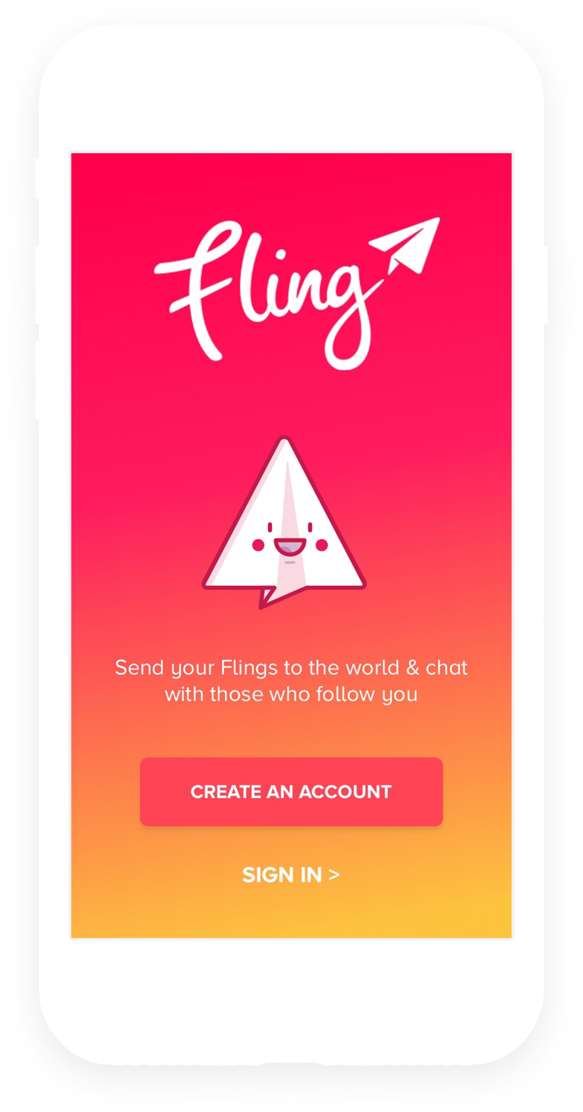
The app is probably where people will be in closest contact with the brand. The challenge was to bring to life the new identity and to have it feel; fast, inviting, and responsive to user input.
The new platform allowed users to easily experience content from places in the world they never knew existed, engage with other people effortlessly and feel safe doing so.
Represent
The app icon
The app icon is something we really wanted to fly out of the screen and represent the platform in a single asset.
iOS
Android
Some of the icon experimentation
A family affair
Icons for every occasion
With the idea of keeping each Fling special and surprising, Flings aren’t immediately visible. Unlike Facebook or Instagram, Flings arrive in a “Closed” state and a user has to hold down to view them. We wanted the icons to be so appealing that the user feels the Flings come alive when they touch them.
A lot of experimentation paved the way for 22 new icons for use in various product contexts. Closely related to the logo, they all derive from it with elements like weight, shapes, geometry and colour.
Going places
The brand in action
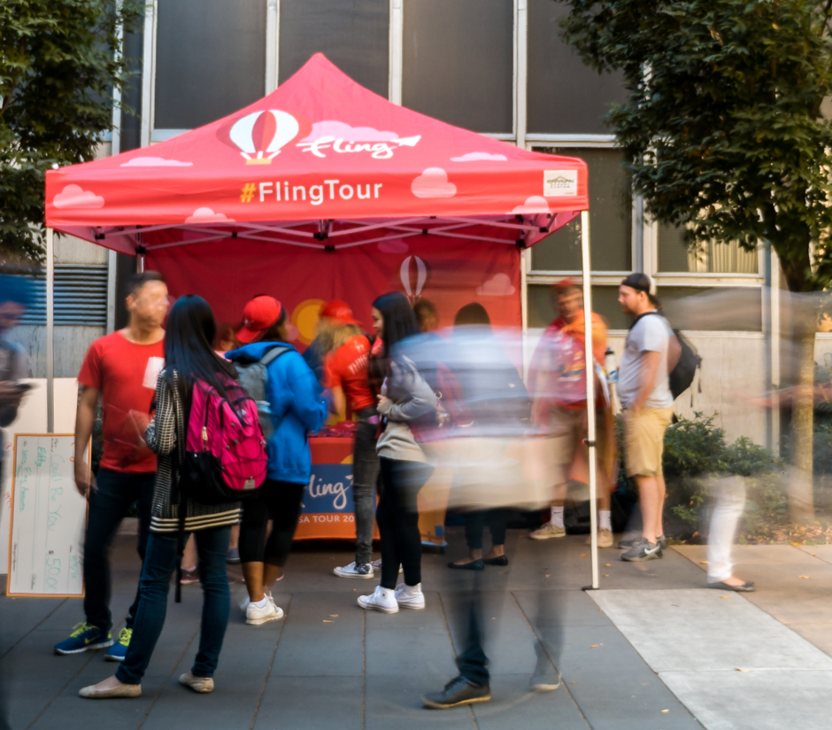
A plane is safe in the hanger, but that’s not what planes are for. The new brand is built to go from the safety of a style guide into the messy world out there, and live to tell the tale.
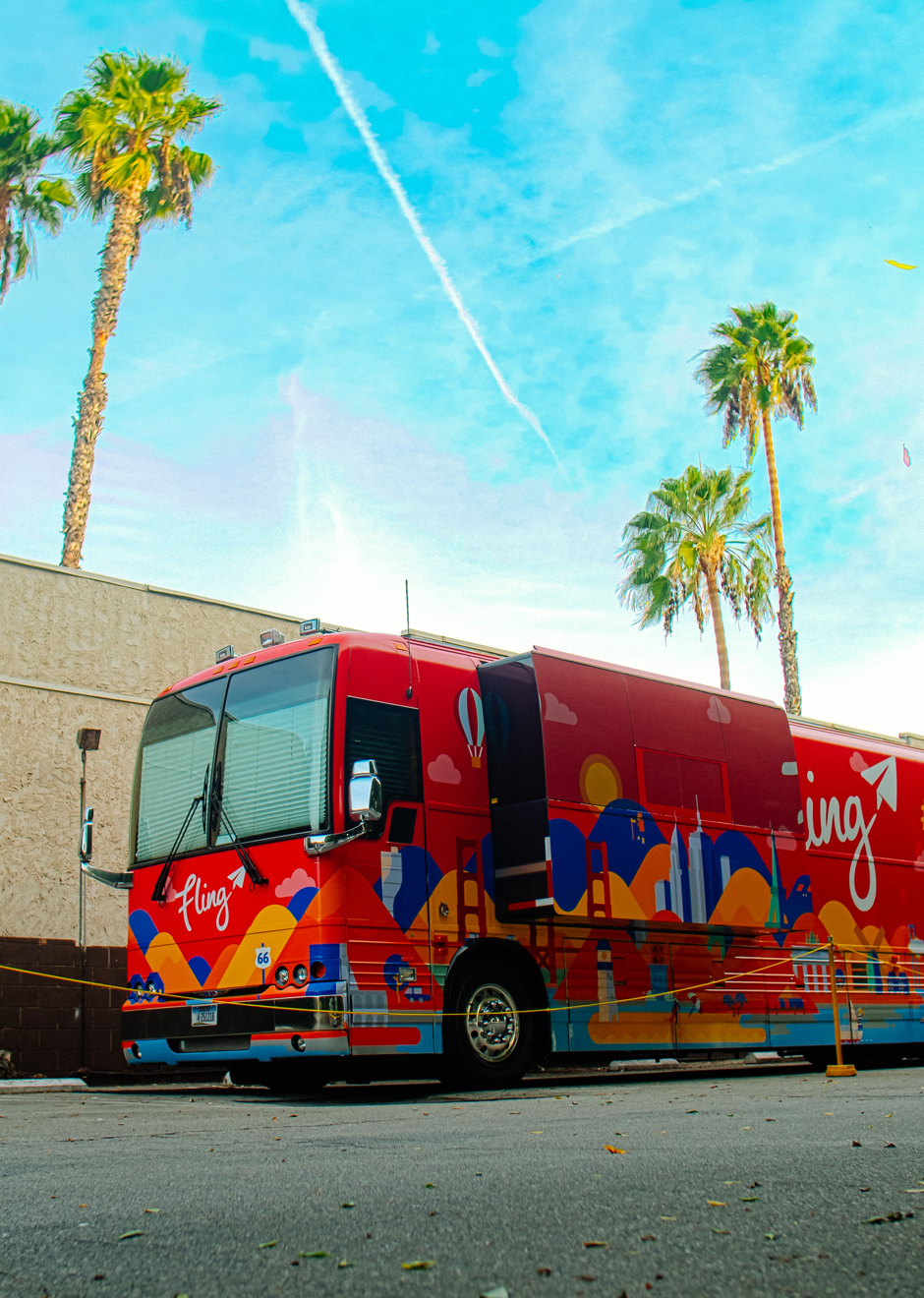
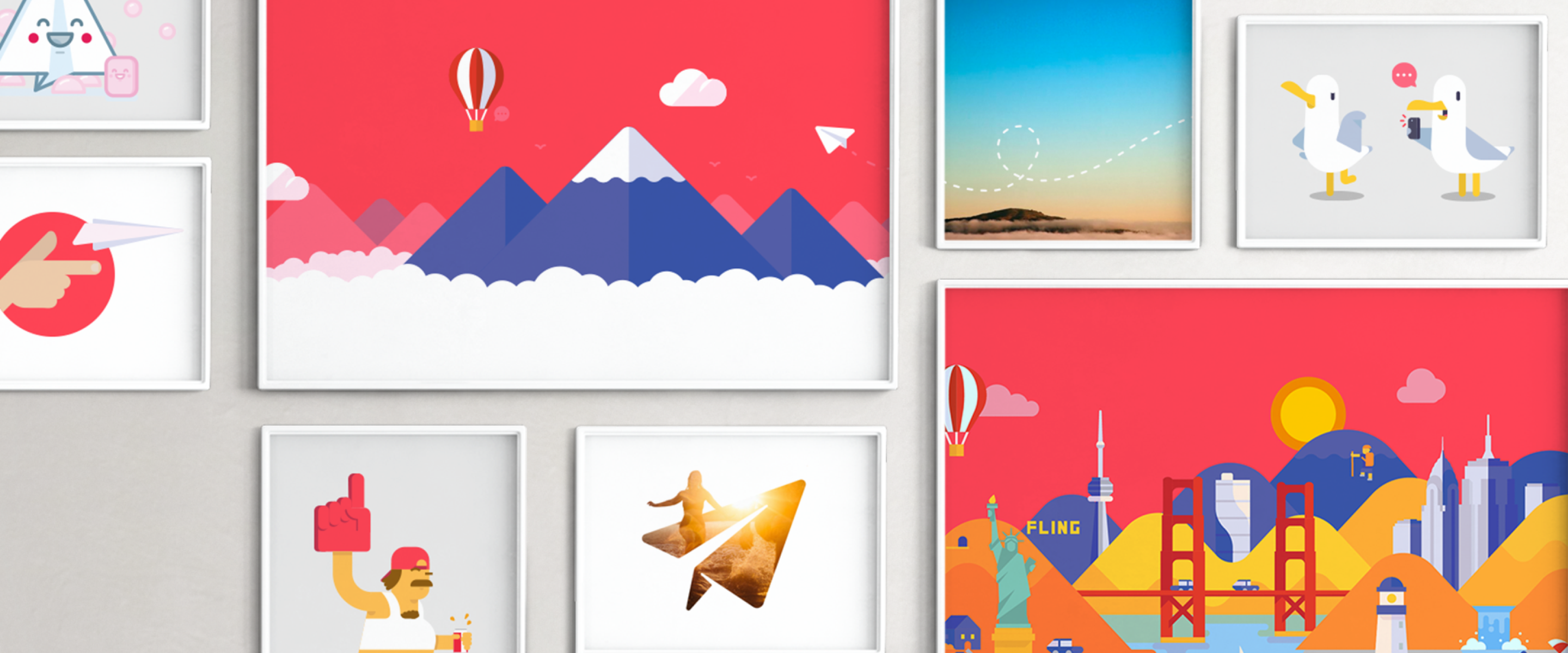
Friendly, funny and easy-to-understand illustrations we created for the app, emails, a bus and various other promotional materials.
Full of emotion
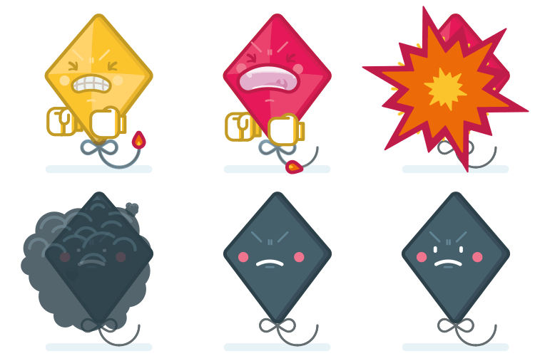
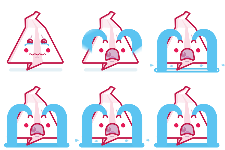
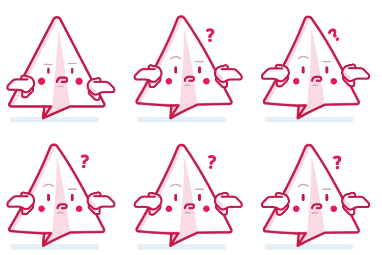
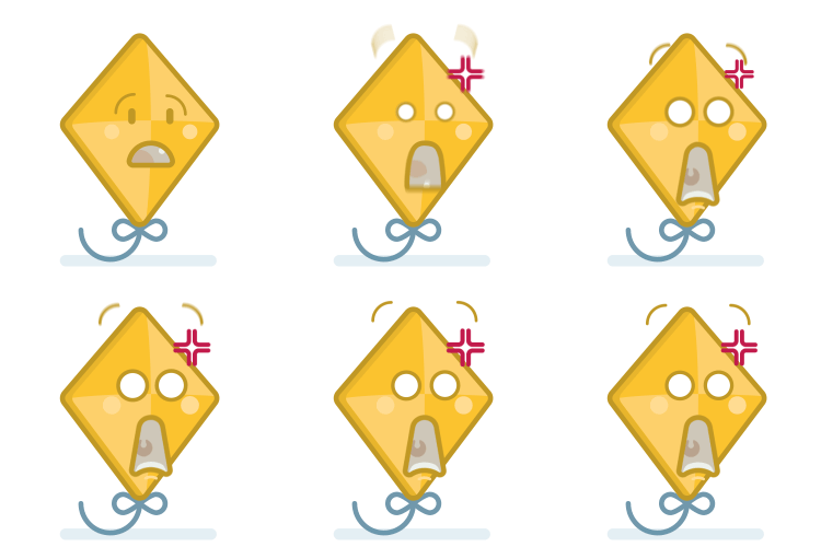
Digital stickers
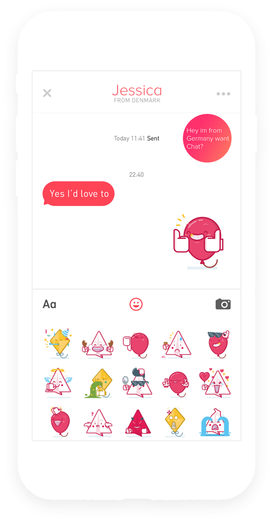
A fun bunch of mascots were designed to illustrate, guide, and celebrate milestones in the app. Further down the line some smart fellow had the bright idea of transforming these into animated stickers for use with the app’s new messaging function, with the goal of separating Fling’s from other social media apps.
Storyboard stills, developed for the animation team to work from
24 custom animated stickers were created, to help users convey their emotions without typing a letter.
Early discussion brought to light the desire to assimilate the feeling of having your own local market or simply visiting one. Like any trade scenario, the “shop owners” needed transparent context about the offers being made on their items; who was making the offer, when it was made and most important, what they are offering.
On the other side, the “buyers” needed the same amount of information; fundamentals about the item they are interested in, it’s location, reliability of the “shop owner”, the best ways to communicate and constantly providing crucial feedback to the user who has made an offer or purchase, updating them on the progress and showing the results, encouraging future interactions and exploration.







"Millions of users and a lot of cash is great, but it doesn’t matter unless your app is cool. Luckily, Fling has a remarkably well-designed app that’s a blast to use"
TechCrunch
October 2015
It’s landing
Here are a few stats about how Fling has been doing
5
million users worldwide
13
billion flings delivered
33
million flings delivered a day
1.1
million monthly active users
300
thousand daily active users
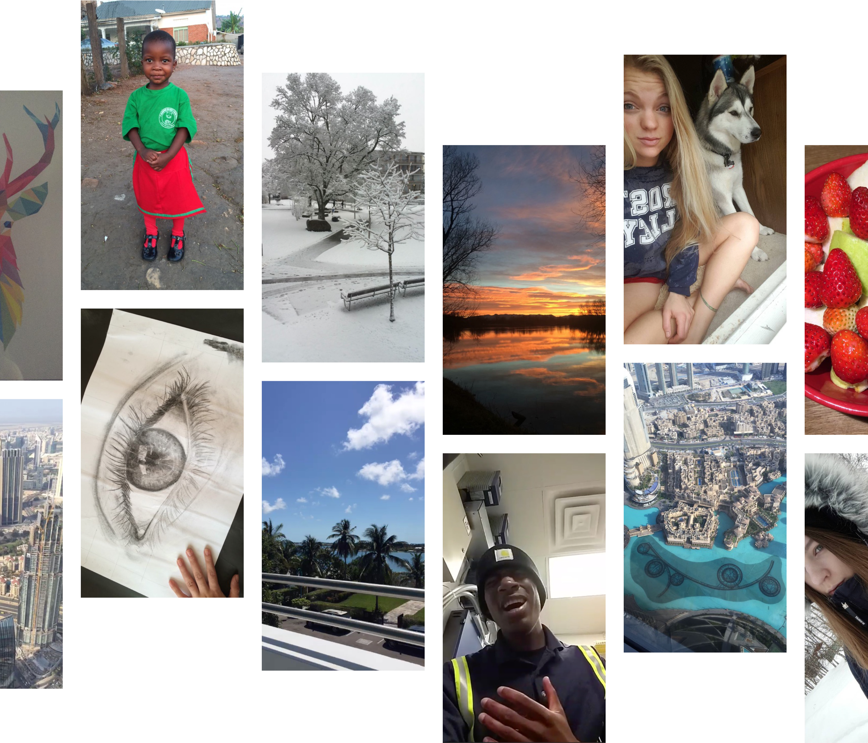
Some of the Flings that have been sent
Browse more projects
© 2022 7robots ltd

